


 Designer: Christian Cervantes
Creative Director: Chuck Rudy
Executive Creative Director: Brian Collins.
From: Agency BIG
For: The Tribeca Film Festival's fifth anniversary identity(2006)
The Problem
Creating a design that lived up to the past identities of The Tribecca Film Festival and it's prestigious heritage. They wanted something bold that would stand out while still incorporating the highlight which was that it was their 5th anniversary.
It was definitely a challenge to get everyone together on creating this piece since it was pro bono, it wasn't their biggest priority amongst the company. While creating this advertisement, they had other projects to work on as well and had to divide their time equally.

It was definitely a challenge to get everyone together on creating this piece since it was pro bono, it wasn't their biggest priority amongst the company. While creating this advertisement, they had other projects to work on as well and had to divide their time equally.

The Process
They went about designing this by comparing past identities from the festival, they wanted something different from past designs but still keeping with the modern look. Research and collaboration was the key element in their design process. After their design was collaborated amongst the group they set about making many different variations in color and size to display for advertising.
Advertisement

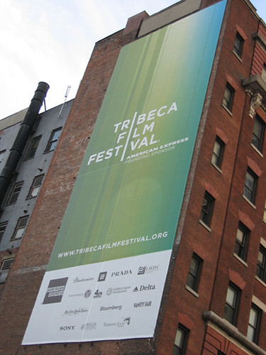
Placement of these advertisements were placed everywhere among town, on the sides of buildings, posters, handout flyers as well as placed all over the internet along with their own website.. Not that people didn't already know about the Tribeca Film Festival, the advertisement was still plastered about enough to make the film festival known.
Results
The results were very successful, everyone loved the new identity they created and are still being used in the most recent Tribeca Film Festival advertisements. The bold colors and modern images were the perfect fit with the ahead of the curve Films that debuted that year. Although this campaign was a couple years ago now, it is still widely known and related back to for current designs.
5 comments:
It is official - posters are the most fun thing to design. It is interesting to find out what they were going for behind the poster. I think that they accomplished they modern feeling. Great investigation.
I like the fact they created several versions of the poster. The logo successfully unifies all of them.
Even though it was a pro bono project the event is prestigious. The bar was set high for their solution. Ultimately it is work which will garner them much recognition.
You're right Liz, posters rule. Everybody says "Print is dead", but I don't think posters will ever disappear. I like the typography used in these examples.
The posters are beautiful. I think that the choice to place the green one on the red brick building was a good design choice. Its also fun to look at the difference in the scale of the works.
I think it's really difficult for someone to try and build something that already has history and has been etched into peoples minds.
I really like the color combination of the different purple and blue shades.
Post a Comment